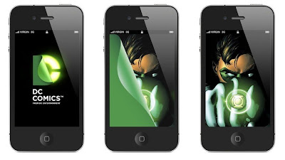
I don’t know about you, but I’m pretty disappointed in DC Comics’ new logo. I think Paul Montgomery (Twitter) summed it up best, the “new DC logo looks tailor made for the OSX dock. It's pretty fun as a graphic, but I only get that it stands for "DC" because I already knew.” From what I’ve seen of the pictures, this logo is going to be a sick graphic! I can already see it morphing on my computer, iPhone and iPad, or introducing us to the newest episode of our favorite DC cartoon or television show. And you know they had to have this ready before The Dark Knight Rises premiers next summer. But what about the other 85% of the time!?!
I can’t fault DC for trying and taking risks. When everyone else said they were nuts for rebooting their entire comic universe, DC forged on and did what they thought was best. It seems to have worked out for the best, and they’ve even quieted some of their strongest critics. And while this logo seems destined to usher in the company’s new digital age, I can’t help but wonder how the comics in DC Comics fit into all this?
As Paul said, no one gets “DC” out of this new logo. It’s practically indecipherable. But what really bothers The Blot is how DC Entertainment’s amazing graphic looks horrible as a static logo for DC Comics. Isn’t that how DC will be primarily using the logo? For every movie, TV show, app and digital comic, there are even more printed comics, toys, collectibles, clothing and accessories to be sold with this horrible logo. While DC’s trying to live in the far off future, it’s forgetting all the great things it has to offer here and now. Clearly “comics” are not the primary focus of DC Entertainment anymore.


